Re-platforming the Wisconsin Department of Employee Trust Funds website from HTML templates to Drupal 8, including a complete visual and user experience redesign.
etf.wi.gov
An Effortless Customer Experience for Wisconsin Government Employees, Retirees, and Employers
On
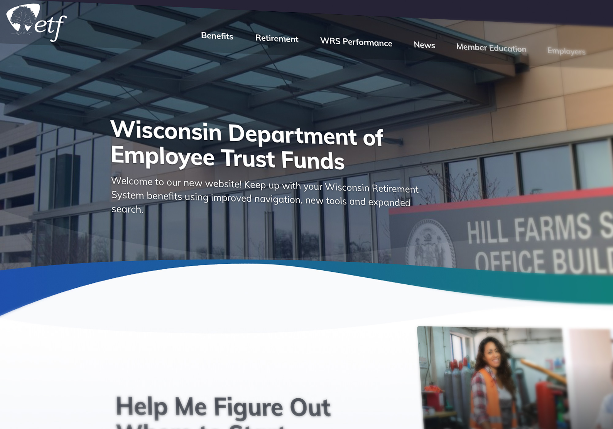
The Wisconsin Department of Employee Trust Funds (ETF) is responsible for managing the pension and other retirement benefits of over 630,000 state and local government employees and retirees in the state of Wisconsin. With approximately $98 billion in assets, the Wisconsin Retirement System is the 8th largest U.S. public pension fund and the 25th largest public or private pension fund in the world.
In addition to overseeing the Wisconsin Retirement System, ETF also provides benefits such as group health insurance, disability benefits, and group life insurance. Over a half-million people rely on the information ETF provides in order to make decisions that impact not only themselves, but their children, and their children’s children.
The Challenge
Given the extent of services provided by ETF, their website is large and complex with a wealth of vital information. When ETF first approached Palantir.net, their website (shown) hadn’t been updated since the early 2000s, and it lacked a content management system. The site wasn’t accessible, it wasn’t responsive, and its overall user experience needed a drastic overhaul.
Simply put, Wisconsin government employees could not easily navigate the crucial information they need to understand and make decisions about the benefits that they earn.
The new ETF site should lower customer effort across all touchpoints. An effortless customer experience: One stop, fewer clicks and increased satisfaction.
Key Outcomes
ETF engaged Palantir to re-platform their website from HTML templates to the Drupal 8 content management system, including a complete visual and user experience redesign. After partnering with Palantir, the new user-friendly ETF site:
- Provides ETF staff and all website visitors with a seamless experience
- Allows Wisconsin government employees, retirees, and employers to efficiently access accurate and current information
- Incorporates best practices for content publication for the ETF digital team
Upgrade to the Employee Benefits Explorer
One of the most notable features of the new site is ETF’s Benefits Explorer.
An important function of the ETF site is offering information regarding pension, health insurance, and other benefits. On ETF’s old site, employees were required to select cumbersome and confusing benefit options before they could find detailed information about their benefits. This task was made even more difficult by the fact that the names of benefit options are not descriptive or intuitive. ETF’s previous solution was to send physical mailers with distinctive photos on the covers, and then direct visitors to the website to select the benefit options that had the same image as their mailer.
Palantir and ETF knew that the “find my benefits” user experience needed a complete overhaul. In our initial onsite, we identified a potential solution: creating a database of employers and the benefit options they offer. With this list we built a benefits explorer tool that allows ETF’s customers to search for benefits by the one piece of information they will always definitely have: the name of their employer.
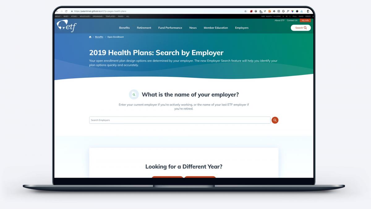
With the new explorer experience, site visitors begin by typing in the name of their employer and are immediately provided with their benefit options. We built two versions of the tool: one for the specific task of identifying health plan options, which are typically decided once a year during open enrollment, and one for identifying all benefits offered by your employer, which can be used any time of year.
The new “My Benefits” explorer is now the second most visited page on the new ETF site, which shows just how helpful this new feature is for ETF’s customers.
How We Did It
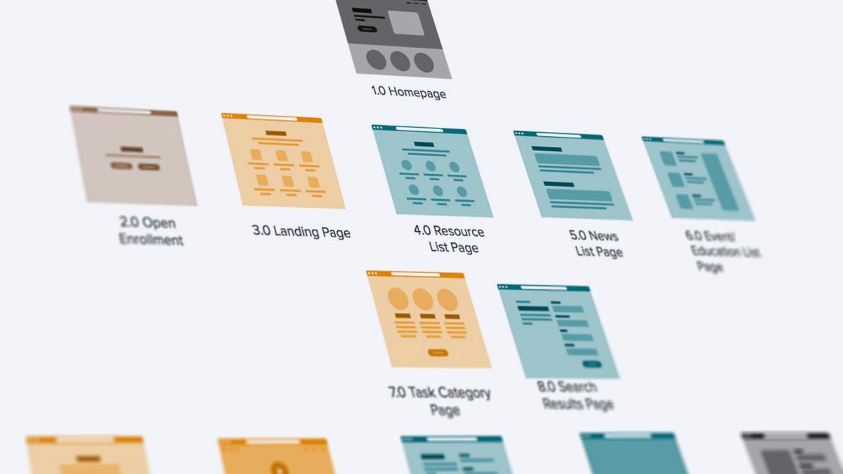
In order to transform the ETF website into an effortless experience for Wisconsin government employees, retirees, and employers, there were five critical elements to consider.
Our approach involved:
- Identifying “Top Tasks”
- Revising content
- User-testing the information architecture
- Crafting an accessible, responsive design
- Replatforming on a robust Content Management System: Drupal
Identifying “Top Tasks”
The biggest negative factor of the previous ETF site’s user experience was its confusing menus. The site presented too many options and pathways for people to find information such as which health insurance plan they belong to or how to apply for retirement benefits, and the pathways often led to different pages about the same topic. Frequently, people would give up or call customer support, which is only open during typical business hours.
Palantir knew the redesign would have the most impact if the site was restructured to fit the needs of ETF’s customers. In order to guarantee we were addressing customers’ most important needs, we used the Top Task Identification methodology developed by customer experience researcher and advocate Gerry McGovern.
Through the use of this method, we organized ETF’s content by the tasks site users deemed most important, with multiple paths to get to content through their homepage, site and organic search, and related content.
Revising Content
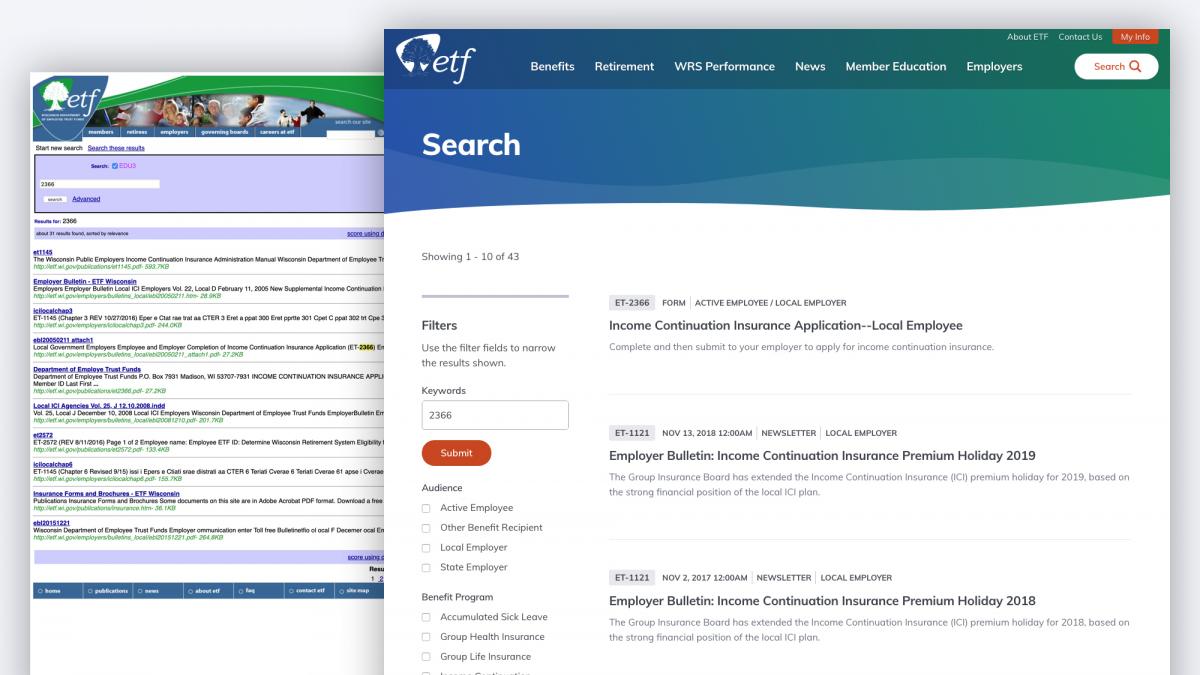
Our goal was to make content findable by both internal and external search engines. No matter what page a visitor enters the site on, the page should make sense and the visitor should be able to find their way to more information.
While the Palantir team was completing the Top Tasks analysis, the internal ETF team revised the website content by focusing on:
- Plain language: ETF had convened a “Plain Language” initiative before engaging with Palantir, and that team was dedicated to transforming the tone of ETF’s content from stiff, formal legalese to a friendlier, more accessible tone.
- “Bite, snack, meal” content writing strategy: The ETF team used this strategy to “chunk” their content for different levels of user engagement. A bite is a headline with a message, a snack is a short summary of the main points, and a meal is a deep dive into the details.
- Improving metadata for accessibility and search: Palantir provided guidance on standardizing metadata, particularly for ETF’s PDF library. The ETF content team made sure that all their content had appropriate metadata.
User-tested Information Architecture (IA)
Once we had the results from our Top Tasks study, we worked toward designing a menu organized intuitively for customers. In our initial onsite, we conducted an open card sort with about 40 ETF stakeholders. Our goal was to have the ETF site content experts experiment with ways to improve the labelling, grouping, and organization of the content on their site.
We divided the stakeholders into six teams of five and gave them a set of 50 cards featuring representative content on their site. The ideas our teams generated fell largely into two groups:
- Audience-oriented: content is organized by the role/title/person who uses it. In this approach, main menu terms might include Retiree, Member, and Employer. This approach was how ETF had content organized on their site at the time of the exercise.
- Task-oriented: content is organized by the type of task the content relates to. In this approach, main menu terms might include Benefits, Retirement, and Member Education.
When we came back together as a group, our team of 40 stakeholders agreed that exploring a task-based information architecture would be worthwhile, but there was significant concern that switching away from an audience-based IA would confuse their customers.
Since making the site easy to use was one of our top project goals, our teams agreed to a rigorous IA testing approach. We agreed to conduct two rounds of tree tests on both an audience-oriented and task-oriented IA, and conduct three additional rounds of tests to refine the chosen approach.
Ultimately, our tests showed that the most intuitive way to organize the content for ETF’s range of customers was to organize by task, with one significant exception: Employers. ETF serves the human resources teams of all state of Wisconsin employers, and those users had completely separate content requirements from those of government employees and retirees.
Responsive Design System on Drupal
Because the former ETF site was significantly outdated, it completely lacked a content model, and the site itself was a massive hodgepodge of design elements. Palantir identified key ETF user flows, matched the content to each flow, and then abstracted out templates to serve each flow.
The overarching goal of this design system is to create intuitive, repeatable user flows through the website. These patterns enable visitors to quickly scan for the information they need, and make quick decisions about where to go next.
Accessibility and responsiveness are core requirements for ETF. Palantir used the a11y checklist from the very beginning of our design process, and continuously tested our visual designs for font size, color contrast, and general spacing of elements to ensure that accessibility was built into our design rather than retrofitted at the end.
We also conducted usability tests with real users, which helped us make accessibility improvements that accessibility checkers missed. In addition, the new design system is also fully responsive, which enables ETF’s customers to access the site from any device.
Robust Content Management
In addition to the efficiencies gained for site visitors, the new Drupal 8 site streamlines the content management process for the internal ETF site admin team. Previously, content creation happened across people and departments with minimal editorial guidelines. Once the copy was approved internally, the new content was handed to the webmaster for inclusion on the site. The process for updating content frequently took weeks.
With their new Drupal 8 platform, the ETF team has moved to a distributed authorship workflow, underpinned by the Workbench suite of modules which allows for editorial/publishing permissions. Now, ETF subject matter experts can keep their own content up to date while following established standards and best practices. The decision to publish content is still owned by a smaller group, to ensure that only approved and correct content is uploaded to the live site.
The Results
With the fully responsive design system in place, the new ETF site offers a significantly upgraded user experience for their customers:
- Task-oriented: Our data-based top tasks approach ensured that we kept the focus on the user’s journey through the site. Everything from the menus to the page-level strategy to the visual design was geared towards making it effortless for visitors to achieve their most important tasks.
- Structured content: Not only has the website’s content been rewritten to be more scannable for readers, but it’s also now structured for SEO. Our initial user research uncovered search as one of the most frustrating aspects of the site: “The main thing for me is really the search results: the most up to date version is never the first thing that turns up” By adding metadata to ETF’s library of PDF forms and transforming their content from freeform text to structured data, ETF’s search experience has made a complete turnaround.
- User testing: Our strategy and design work was validated throughout the engagement with real site users, which kept us all grounded in the outcomes.
- Accessible and responsive design: The design system isn’t just WCAG A.A compliant according to accessibility testing software – we worked with users to ensure that the site delivers a good experience with site readers. Incorporating a11y standards from the very beginning of the design process ensured that accessibility was baked into our design rather than a last-minute add on.
Palantir created a task-based navigation and content organization to support the customer journey, which is contributing to a better user experience. The new site is more personalized and engaging for customers.