
Hermes
The company offers co-packing products and accessories. Therefore, it represents an industry in which competition is fierce – the more reasons for an online store to stand out. And so, there are a few attention-grabbing elements that really make this commerce attention-grabbing.
The first thing is the attractive form of displaying banners and photos on the home page. Slide in was used here – by scrolling the page, the mentioned elements “slide” into their places. The effect is eye-catching and makes you want to stay on the store’s website.
The second thing is definitely the search engine. When typing a search term, suggestions appear. This way, you can find the given product faster – you can immediately see if such a product even is in the store at all. And if it is available there, after calling this product you are taken to a page where further filtering options are provided. It is important because, remaining “on the product”, you begin to narrow down the search in terms of the features of this product. All this means that you are encouraged step by step to look for the goods you want to find – you do not give up, and we do not leave the website.
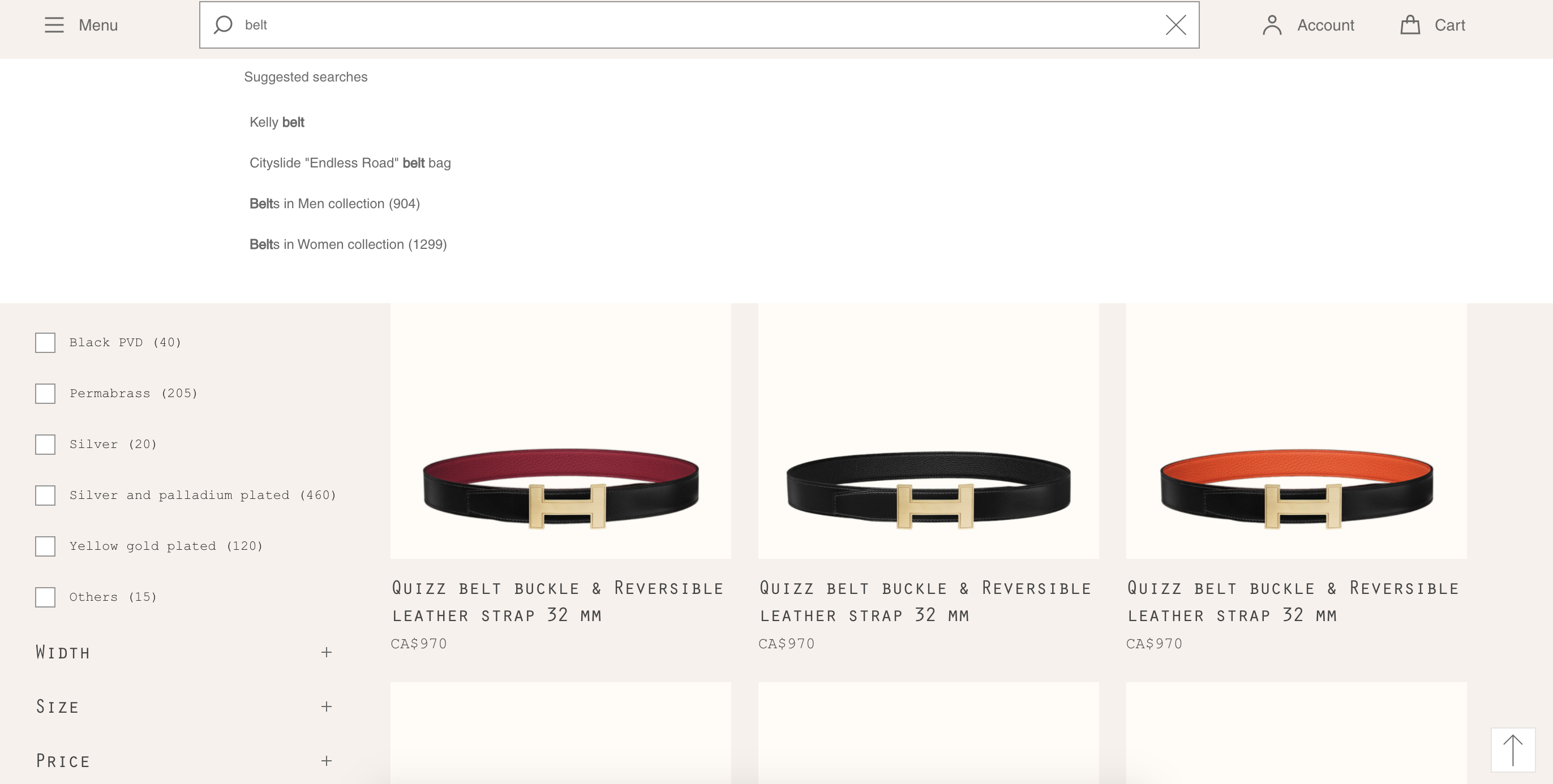
Another thing is the menu. It is located in the upper left corner. After clicking it, a list with categories appears. After selecting the “+” sign, the given category expands – you see the next subcategories, and in the next steps you go to the page with this very product.
Speaking of the menu, it is worth mentioning the rather frugal form of presenting the headline. In addition to the aforementioned search engine, there is also a shortcut for logging-in into the customer account and a shopping cart. All this makes the whole thing legible and easy to navigate.
When browsing the Drupal-based Hermes store, it is impossible not to get the impression that it was very well-thought-out and designed with the customer in mind. So, if you are considering starting your commerce, this example can be a great inspiration. And in combination with the Drupal consulting, you can gain knowledge and advice on how to make your customer stay in your store as long as possible and choose what they are looking for.
JYSK
It is one of the most well-known brands that probably does not require a detailed introduction – and also another Drupal-based store. You can find here other amenities for the customer, as well as inspiration.
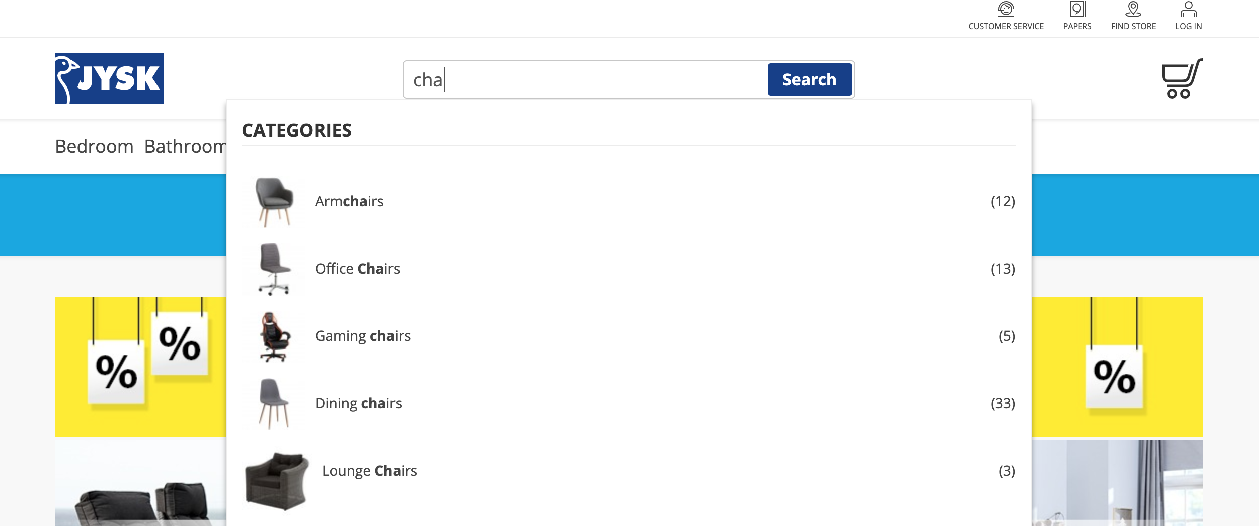
Have you wondered how to make the search engine more attractive? If you add to the Hermes’ example a product image along with the information about the number of variants available in the store, you may obtain a really attractive effect. This is how it looks like at JYSK. You might say it is nothing, but this detail makes all the difference. It undoubtedly meets the customers’ expectations and makes searching for a product significantly easier.
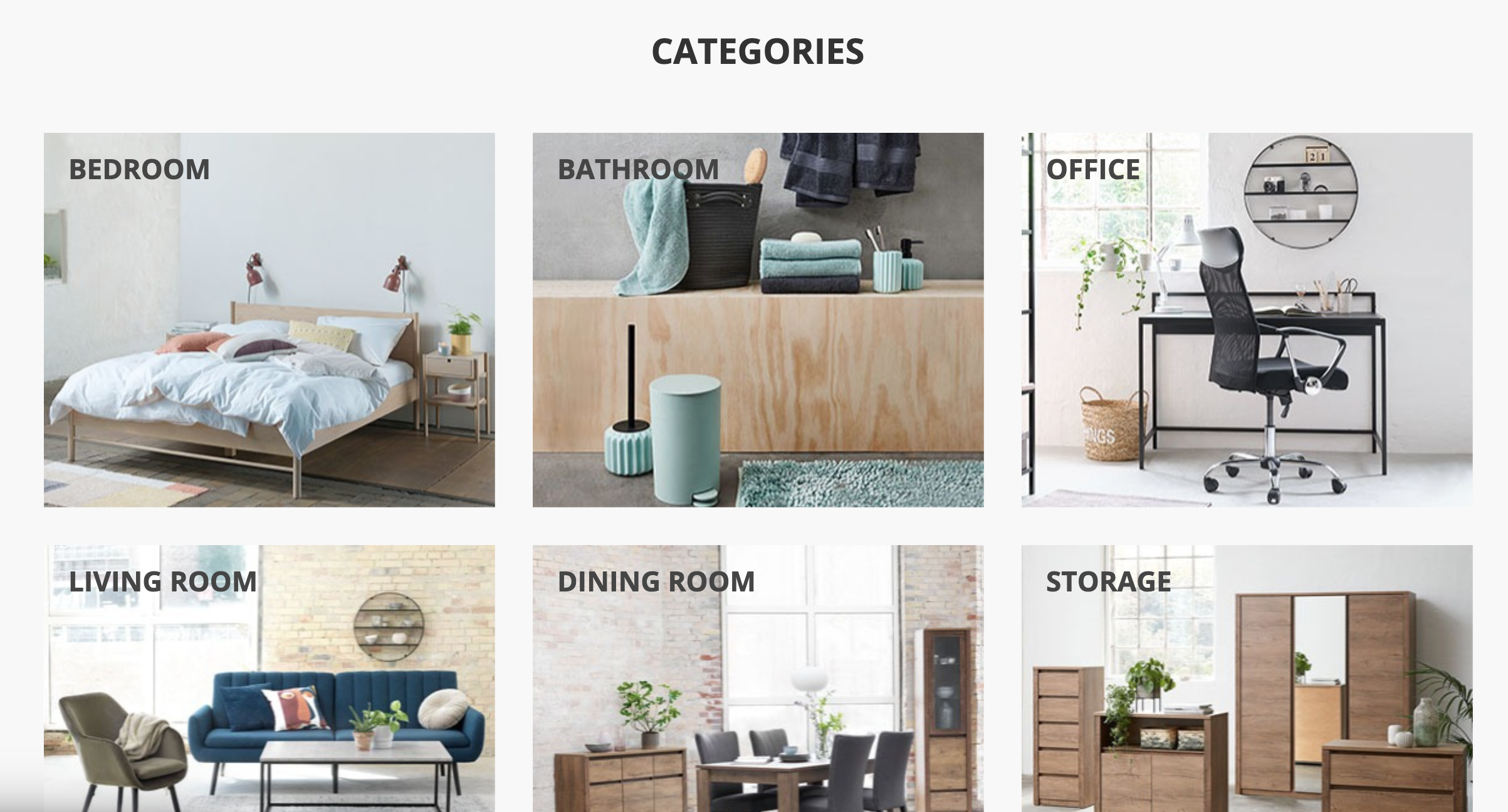
Let us go further. If you offer many products and have many categories, why not present these categories as a gallery on the home page? Thanks to the solution proposed by JYSK, the customer who visits the store receives a visual, and at the same time – friendly, message. You can see then that the owner of the store took care to make it easier for the visitor to navigate the brad product offer.
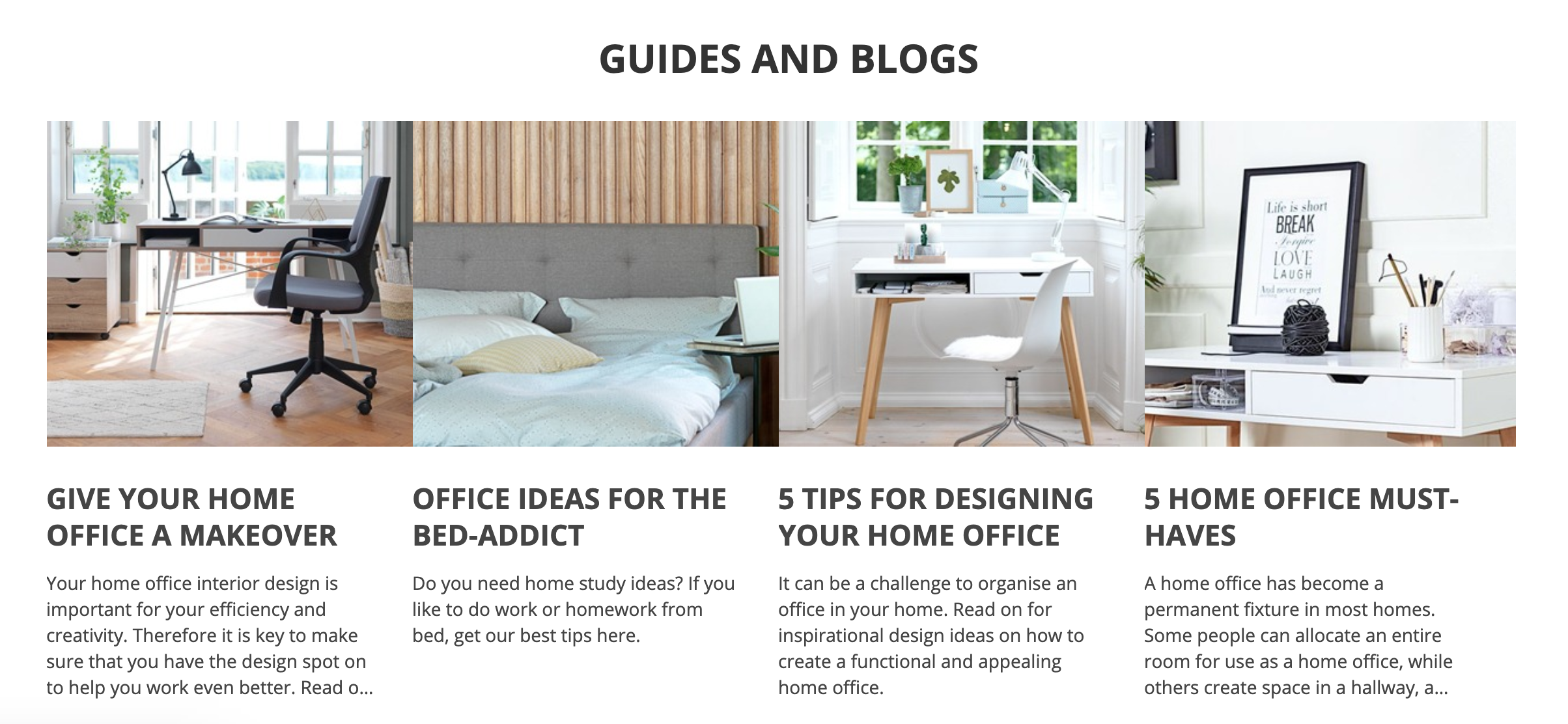
The above solution is continued. After selecting the category, you are still being guided through photos with subcategories, until you finally choose the given product. Between individual steps you can find, e.g. the section with a blog/guide regarding the category you are currently in. It is good to pay attention to this because on other websites the blog is often placed “beside” and sometimes it is a separate element – here it is an integral part of the purchasing process and supports the customer in choosing the product that meets their expectations.
And when you are finally taken to the cart, there is also a well-thought-out solution that takes into account the decisions that the customer may be considering. “Availability check” and “online reservation” caught my attention.
By checking the availability of the goods, at the very beginning, you can check out whether the product is in stock and in how many brick and mortar stores.
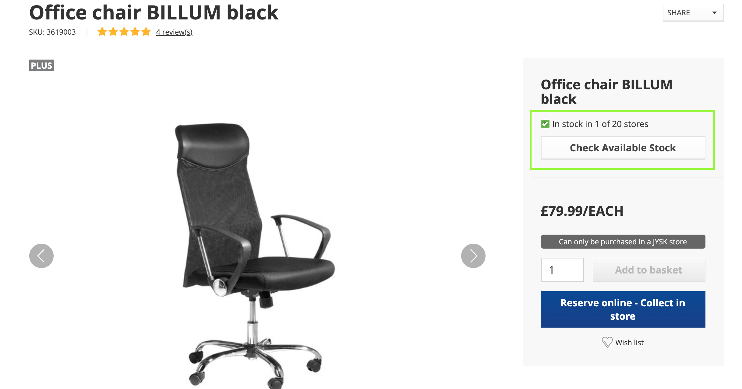
When selecting the checked button, a pop-up appears, where – after entering the city – you receive information about the quantity of the product in the specific store. It is good to mention here that there is also information available about the latest inventory update – I think it is very important knowledge for the user, on the basis of which the customer can be sure that they are viewing the most up-to-date. A similar pop-up with its functionalities appears when making an online reservation.
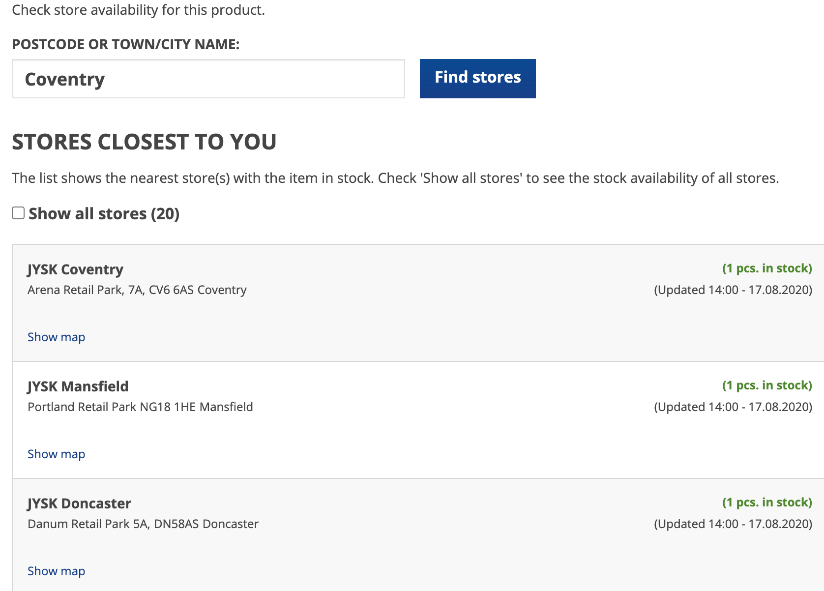
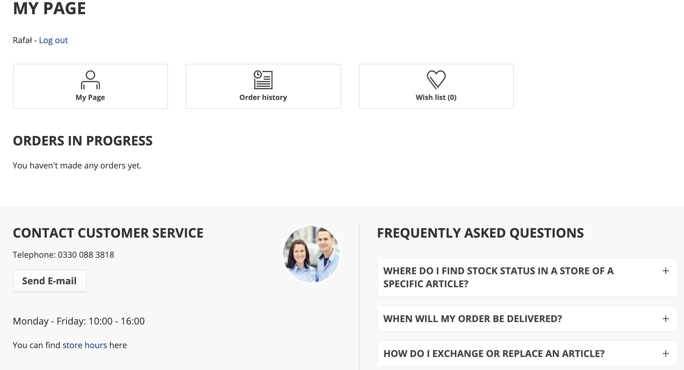
When conducting sales online, you should not forget about the sales at brick and mortar shops – but rather support them in order to provide the customer with a broad range of possibilities and present them with options at every step of the shopping experience. And finally – the customer panel. JYSK took care of the basic functions such as: the profile, the order history, the wish list, and the list of recently viewed items. The FAQ section can be checked here. And just like the blog section placed within the purchasing process, the most frequently asked questions and answers are at hand.
Wilson
Probably almost everyone knows the Wilson brand, but maybe not everyone knows that their online store is built on Drupal.
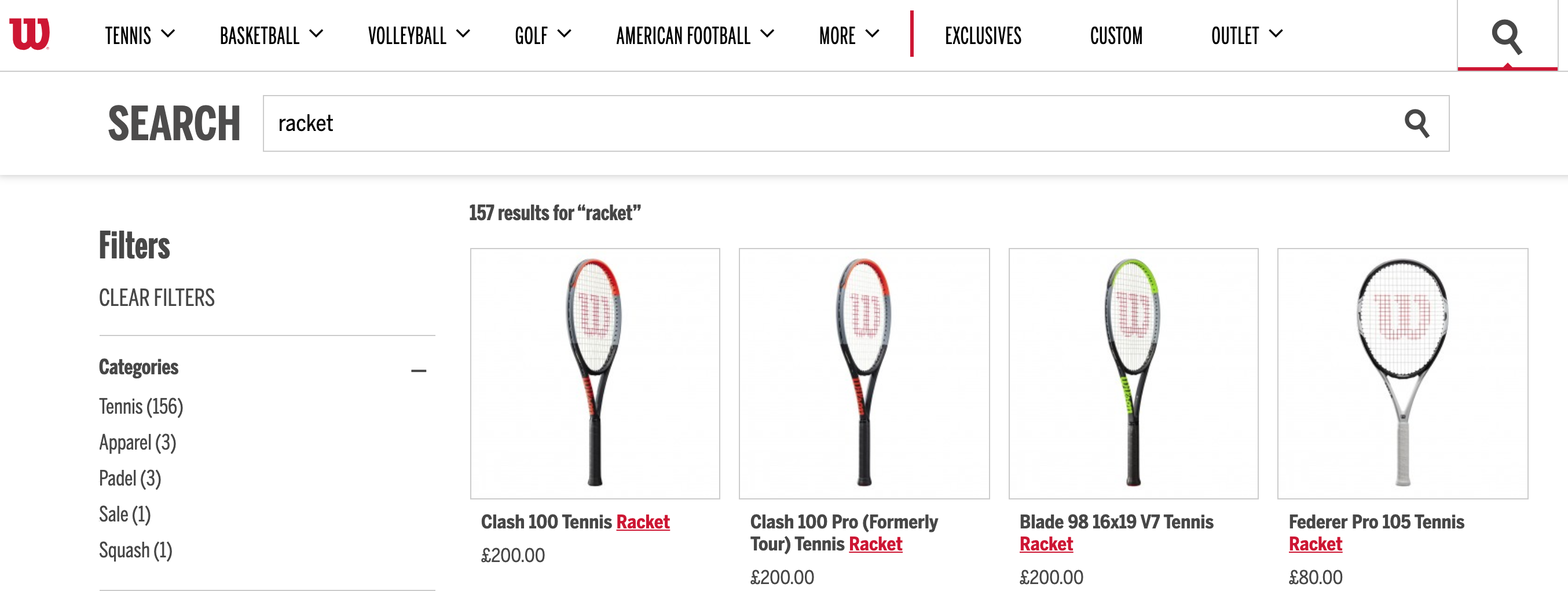
In this case, I also have to start with the search engine again, because it seems that of all the previous examples, this one looks the best. Moreover, it shows that with Drupal you can develop functionalities that may seem inflexible at first glance.
The main difference is the fact that after entering a phrase, you are taken straight to the store, where the page with the desired product, categories and quantity is displayed. In addition, I must mention that the design is characterised by minimalism, thanks to which the whole is uncluttered.
However, I want to focus on the element that makes this store unique and distinguishes it from others. In the main menu, there is a CUSTOM button, which allows for the possibility to “design” a product according to individual needs and tastes.
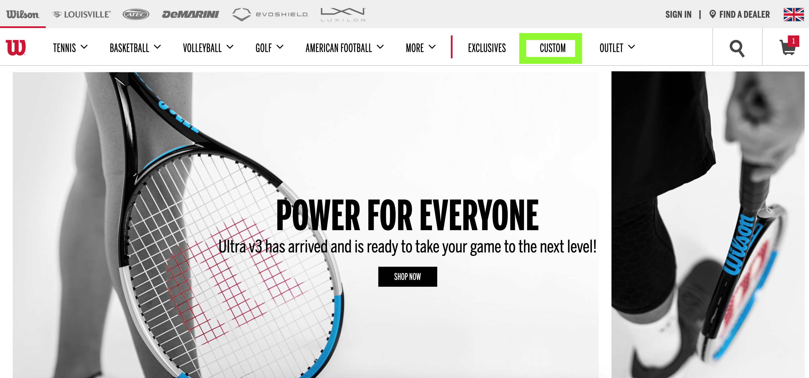
After pressing the button, you are taken to the model (in this case – of a tennis racket) and the selection option.
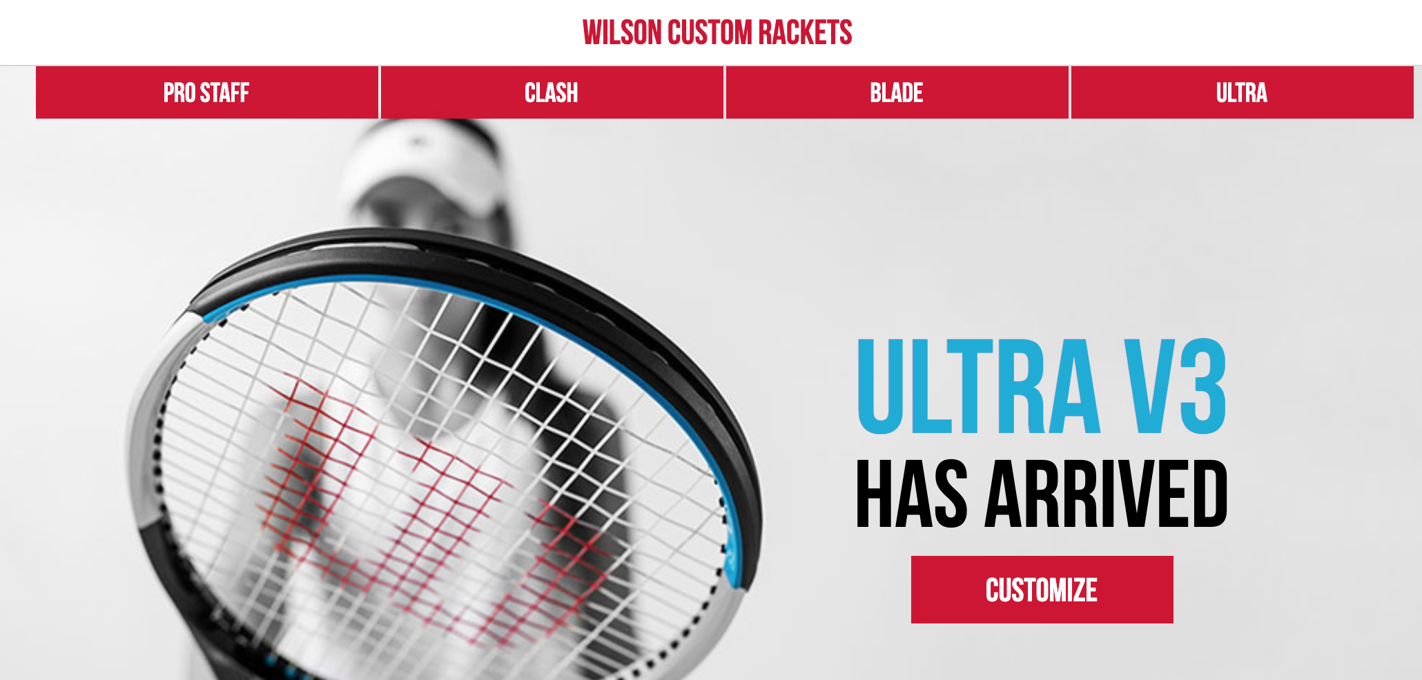
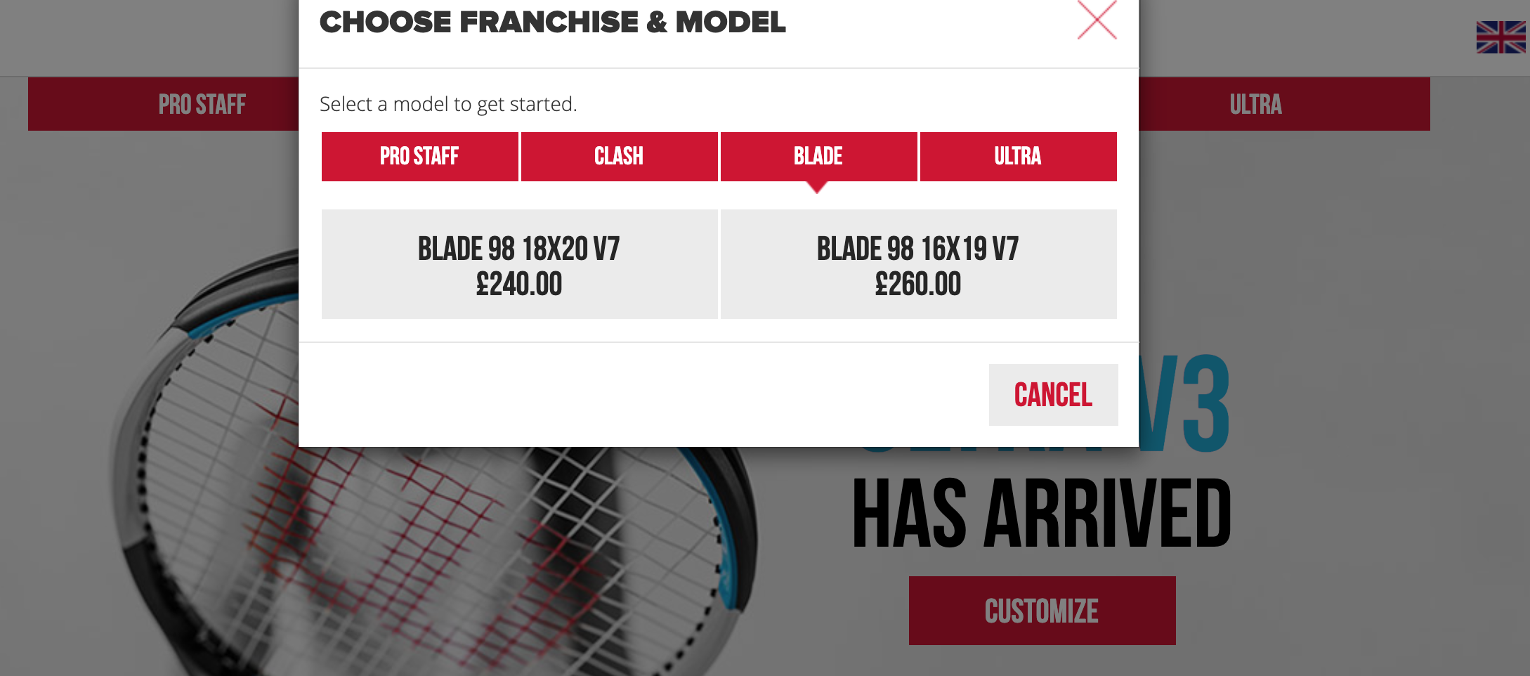
And this is where the adventure begins, one could say. The possibilities of personalising the product are really wide. From the colour, gloss, type of coating, through the choice of the shades of the logotype, to the use of patterns resembling the ones on the rackets of the world’s most famous tennis players. Posting here more screenshots made by me would take up too much space, and at the same time – prevent the interaction with the store’s capabilities. So, I encourage you to visit it and personalise a tennis racket yourself. However, I will attach here the final view of the product, including the information about the estimated time of order completion.
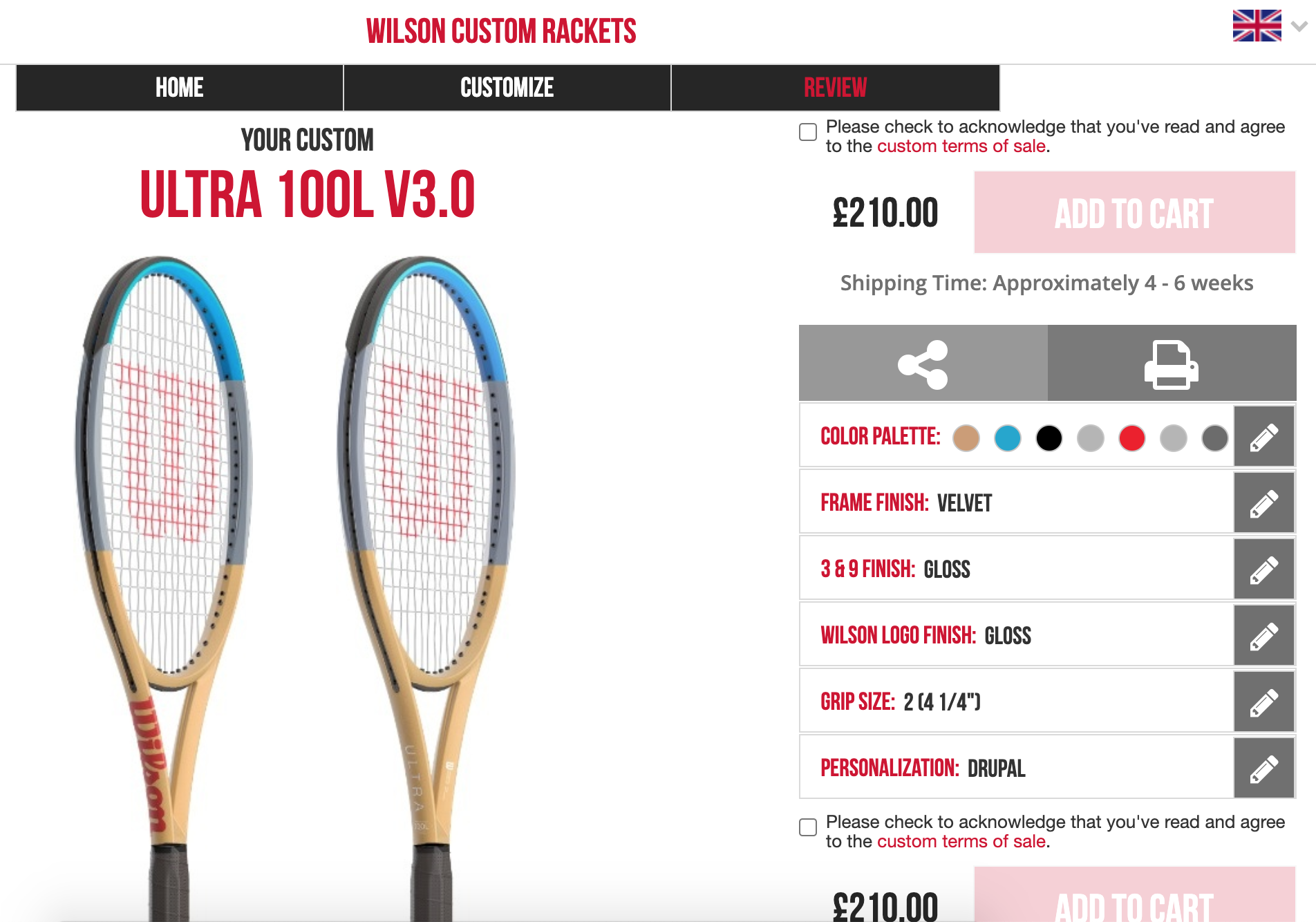
The above example is perfect if your business offer includes products that are being personalised for your customers. With Drupal, you can achieve a unique effect that will keep up with the expectations, and at the same time provide the user with an unusual experience. So, when you will be preparing a brief for a Drupal agency, and your vision will resemble Wilson’s example even a little, I encourage you to include this example. Thanks to this, Drupal team will understand your idea well.
Let us go back for a moment to the home page with the option for finding a dealer.
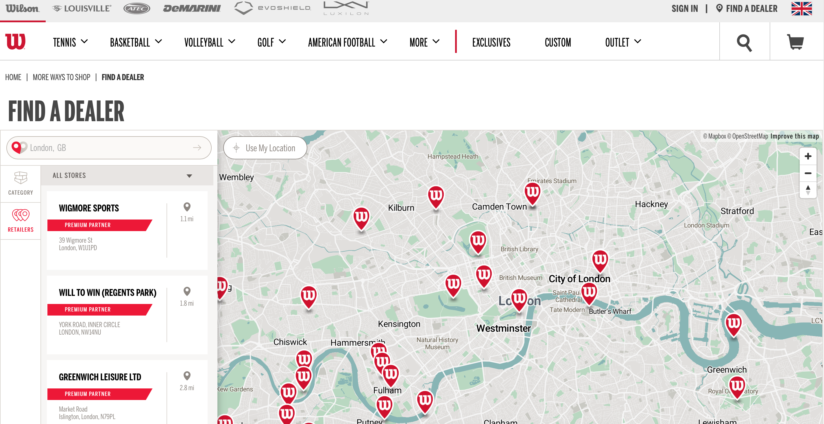
The use of a map turns out to be extremely useful here. After selecting the brick and mortar store you are interested in, its detail appears on the side of the screen, which provides additional filtering by category. In the case of Wilson, the search can be narrowed down depending on the sports discipline in the context of which you will be able to purchase appropriate equipment and accessories.
LUSH
This Drupal-based cosmetics shop may be a good example of a product presentation and designing a customer panel.
As for the former, the gallery plays a key role. Every subpage with a specific type of product is created according to the following pattern: banner, best seller product, other products. Additionally, some of them have information about the stock ending in the warehouse. In addition, there are also references to the content on the blog – so if you have doubts about which product to choose or you want to broaden your knowledge, you do not have to leave the subpage, because everything is here in one place.
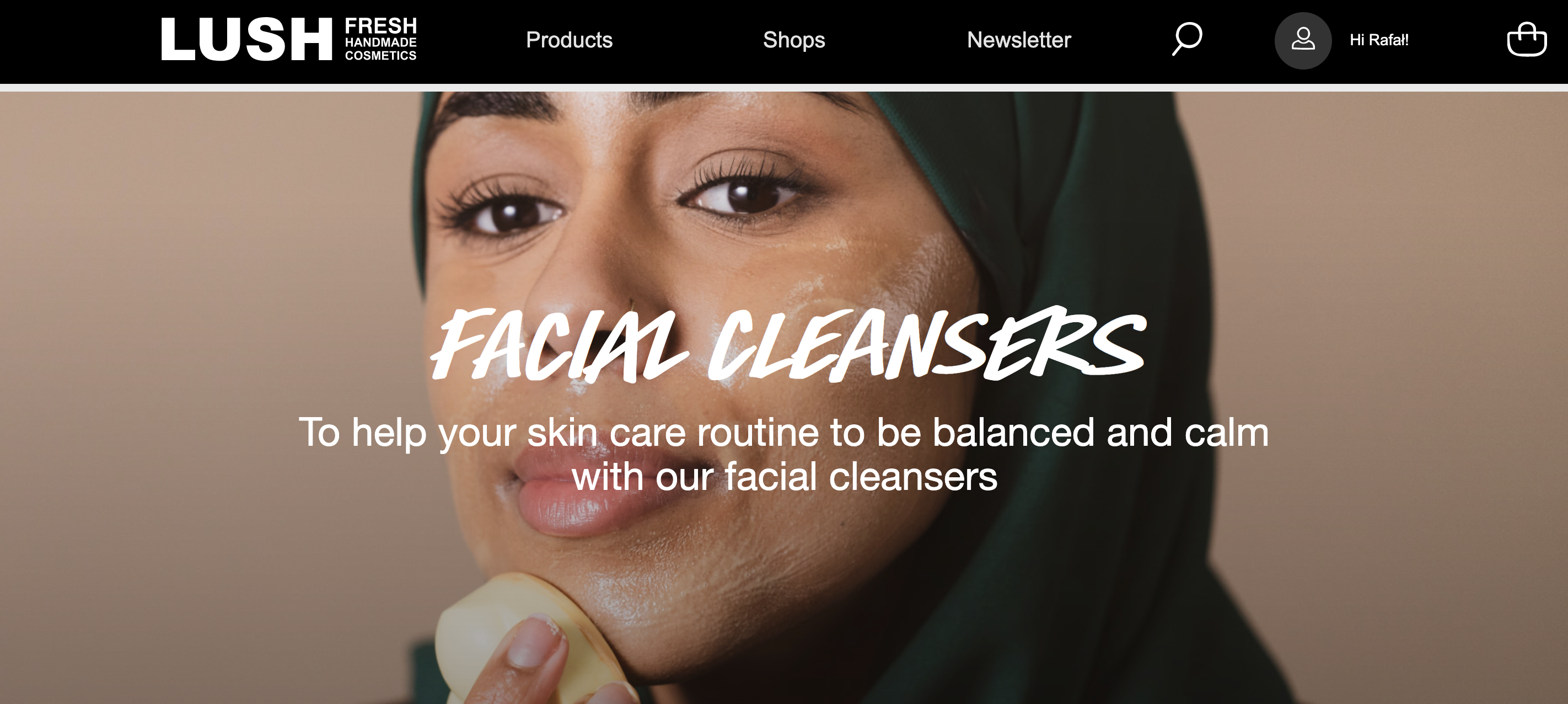
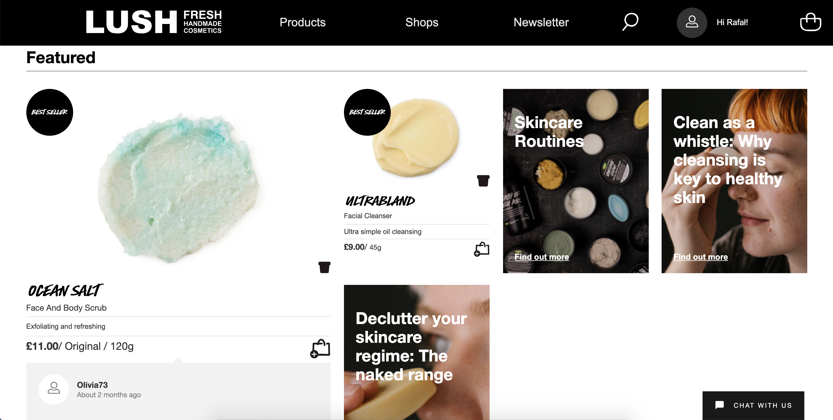
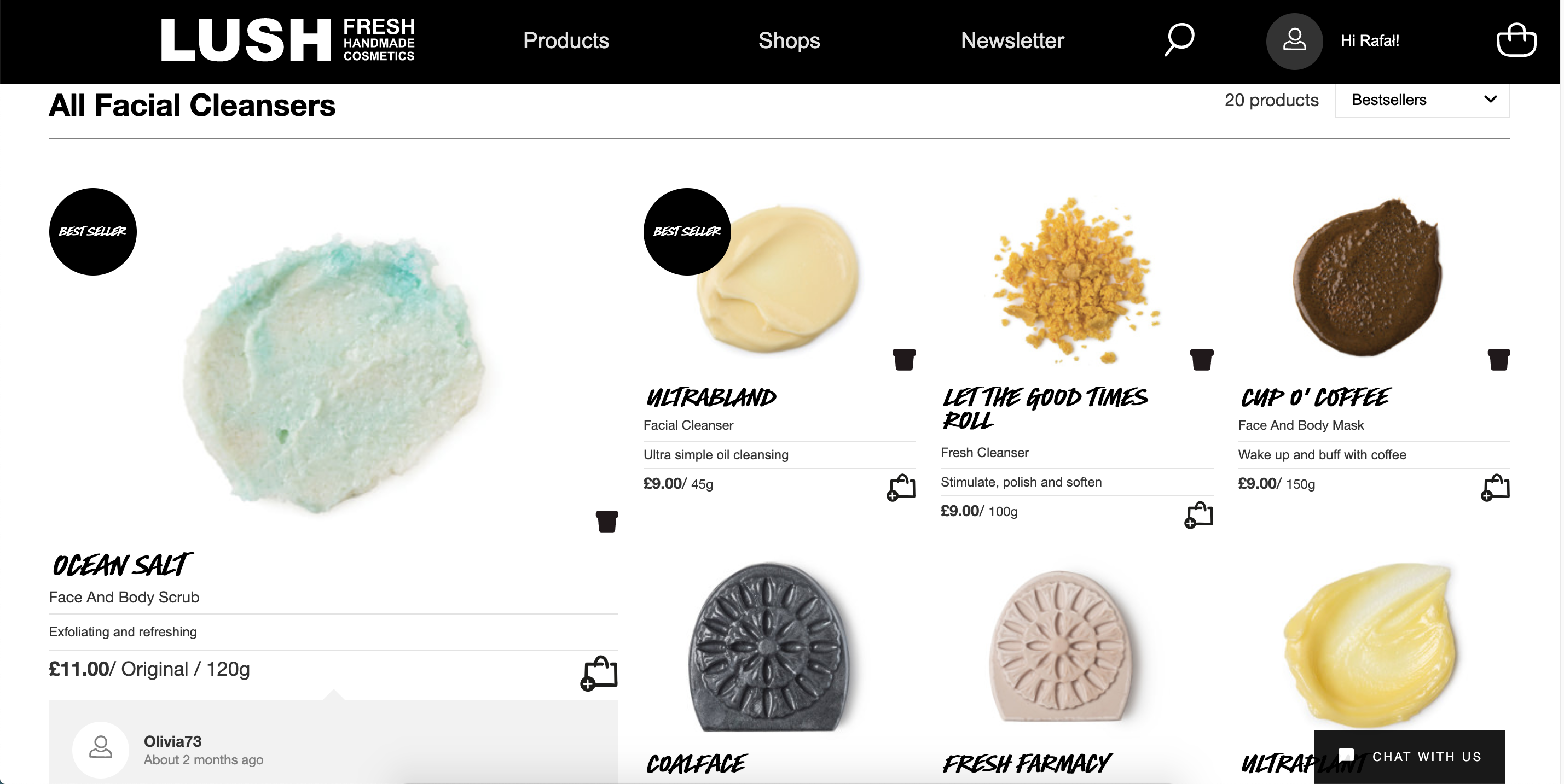
Although there are a lot of photos, you do not get the impression of being overwhelmed with their number. So if you are considering a similar style for your store, use a professional design service.
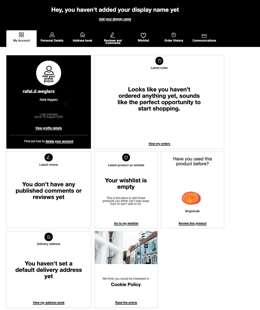
The second element is the already mentioned customer panel. The clear menu draws attention. Navigating and finding your way around your profile is easy and pleasant, which means that the customer may log in there willingly.

Further down the panel, some blocks allow for previewing the content in reference to the panel menu item.
WAM
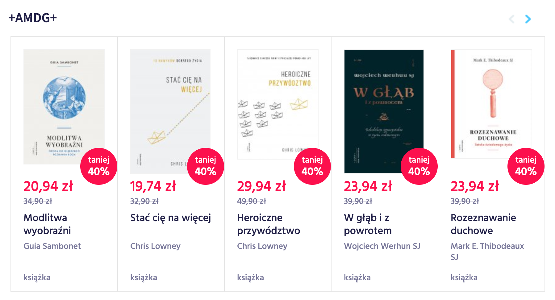
And finally, the WAM publishing house as an example of a Drupal-based store with a large number of books. The distinguishing feature of the home page is its transparency. My attention is drawn to the thematic blocks with books from a given series. Thanks to using the slider, you do not have to enter the given block, but by pressing the arrow, you can move the titles.
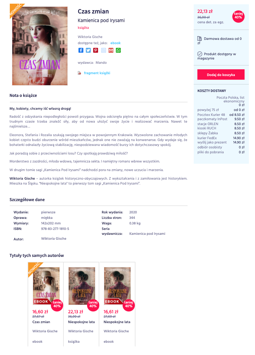
After selecting a book, you go to the product page, where we can learn more about the publication. You also have the option to download an excerpt from the book.
An interesting fact in the store during the ordering is the option of shipping the purchased product as a gift. The customer can choose not only the recipient of the goods but also a decorative packaging. As a result, the buyer of the product to be a gift does not have to worry about packaging anymore. This is a convenient and useful option.
Summary
By choosing a Drupal-based store, you can take advantage of its many possibilities. Depending on what you expect, what you sell, you have a chance to build e-commerce so that your customers stay on your website as long as possible, and the number of conversions is as high as possible. I hope the above examples have inspired you, and you will want to use some of the solutions.